I’ve sat where you are right now. You’ve spent hours—maybe even days—perfecting your offer, setting up your digital marketing campaigns, and watching the traffic trickle in through Google Analytics. But then, you look at the lead conversion rate. It’s flat. It’s discouraging. You start to wonder if your product just isn’t what people want, or if the “magic” of online sales is reserved for someone else.
Here is the hard truth about your landing page: Most people get this wrong because they treat their page like a digital brochure rather than a focused conversion machine. They clutter the space with too much information, confusing the user intent and driving the bounce rate through the roof. But wait, there is a catch—doubling your conversion rate doesn’t usually require a complete overhaul. Often, it’s about micro-adjustments that align with human psychology and modern search engine optimization standards.
In this guide, I want to walk you through five specific, actionable tweaks. We aren’t just looking for “better”; we are looking for a transformation of your sales funnel. As your mentor in this journey, I’ll show you how to reduce cognitive load and turn hesitant browsers into eager leads. Let’s roll up our sleeves and get to work.
Key Takeaways:
- Clarity over Creativity: Your headline must communicate your value proposition within five seconds.
- Friction is the Enemy: Reducing form fields and streamlining the customer journey directly impacts your ROI.
- Trust is Earned: Strategic placement of social proof and trust badges bridges the “credibility gap.”
- Visual Guidance: Using directional cues and white space helps manage the user’s eye-tracking and focus.
- Action-Oriented CTAs: Moving beyond “Submit” to benefit-driven language significantly boosts click-through rates (CTR).
1Tweak 1: The 5-Second Headline Clarity Test
I once worked with a SaaS company that had a headline so “clever” no one knew what they actually sold. They used metaphors about “soaring to new heights.” It sounded poetic, but their conversion rate was abysmal. The secret that experts won’t tell you is that your audience doesn’t care about your wit; they care about their own pain points.
When a user lands on your page, their brain is asking three questions: What is this? What’s in it for me? What do I do next? If your headline doesn’t answer the first two in under five seconds, you’ve lost them. This is the cornerstone of effective copywriting and user experience (UX).

To fix this, move away from vague jargon and focus on your value proposition. Use a “Heading-Subheading” punch. Your H1 should state the primary benefit, while your subheadline provides the context or the “how.” This structure aligns perfectly with search intent, ensuring that if someone arrived via a specific search query, they feel they are in the right place immediately.
2Tweak 2: Radical Friction Reduction in Lead Capture
Now, here is where it gets interesting. Most businesses are so hungry for data that they accidentally kill their lead generation efforts by asking for too much. Do you really need their zip code, job title, and company size just to send them a lead magnet? Every additional form field you add acts like a brick in a wall between you and your customer.
The common mistake is thinking that more data equals better leads. While that can be true for high-ticket B2B sales, for most initial conversions, it’s a conversion killer. We call this “friction.” High friction increases the cognitive load, leading the user to abandon the page and increasing your bounce rate.
3Tweak 3: Deploying Strategic Social Proof and Trust Signals
Let’s talk about the “Loneliness Factor.” No one wants to be the first person to buy from a stranger. In the digital world, your landing page is that stranger. To bridge this gap, you must utilize social proof. However, most people get this wrong by burying their testimonials at the very bottom of the page where no one sees them.
The hard truth is that “hidden” trust is “no” trust. You need to sprinkle trust signals—like star ratings, industry logos, and SSL certificates—near your points of friction (like your CTA button). This provides “risk reversal.” If they see a “Money-Back Guarantee” or a “No Credit Card Required” badge right next to where they enter their email, their anxiety drops significantly.

“Social proof is not just a marketing tactic; it is a fundamental psychological requirement for human decision-making in an uncertain environment.”
Incorporate video testimonials if possible. Seeing a real human face and hearing a real voice creates a level of authenticity that text simply cannot match. If you are a B2B company, display the logos of well-known clients. This “borrowed authority” tells the prospect that if these big brands trust you, they can too.
4Tweak 4: Mastering Visual Hierarchy and the F-Pattern
Have you ever landed on a page and felt like your eyes were bouncing around like a pinball? That is a failure of visual hierarchy. Most amateur landing page builders allow you to throw elements anywhere, but professional conversion rate optimization (CRO) relies on guiding the eye toward the goal.
Research on eye-tracking shows that users typically scan web pages in an “F-pattern” or a “Z-pattern.” They start at the top left, move across, and then scan down. If your most important information—your value prop and your lead capture form—isn’t aligned with these patterns, it’s being ignored. This is why “above the fold” content is still the most valuable real estate on your site.
Use white space (or negative space) to let your content breathe. When you crowd your page with sidebars, pop-ups, and competing images, you dilute the user’s focus. Think of white space as the “silence” between the notes in a song; it’s what makes the melody stand out. High-contrast colors should be reserved for your Call to Action (CTA) buttons to make them “pop” against the rest of the layout.
| Element | The Common Mistake | The High-Conversion Fix |
|---|---|---|
| Navigation | Full menu with 10+ links | No navigation (Removes exits) |
| Images | Generic stock photography | Real people or product shots |
| Copy | Feature-heavy lists | Benefit-driven storytelling |
| CTA | “Submit” or “Click Here” | “Get My Free Guide Now” |
5Tweak 5: The Psychology of the Benefit-Driven CTA
We’ve reached the final hurdle: the Call to Action. Most landing pages fail here because they use generic, low-energy language like “Submit,” “Register,” or “Send.” These words imply work for the user. To double your lead conversion rate, your CTA must focus on the reward.
Think about the customer journey. Why are they on this page? They aren’t there to “submit” a form; they are there to solve a problem. Your button should reflect that solution. Use active, possessive language like “Start My Journey,” “Claim My Discount,” or “Show Me the Results.”
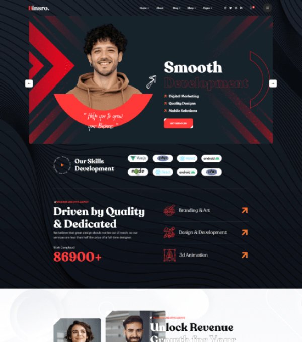
Furthermore, consider the “Micro-Copy” around the button. Adding a small line of text underneath like “Join 5,000+ others” or “Privacy protected, no spam” can remove the final bit of hesitation. This is the “Closer” in your sales process. Don’t let a weak button undo all the hard work you did with your headline and social proof.
Pros and Cons of Rapid Landing Page Tweaks
The Bright Side (Pros):
- Immediate impact on customer acquisition cost (CAC).
- Better data for future A/B testing and multivariate testing.
- Improved brand perception and professional authority.
- Higher quality leads who are more likely to convert into sales.
The Challenges (Cons):
- Requires consistent monitoring of heatmaps and session recordings.
- Initial time investment for copywriting and design adjustments.
- May require technical help for advanced CRM integrations.
6Final Thoughts from The Mentor
Improving your landing page is a journey of empathy. You have to step out of your shoes as a business owner and into the shoes of a tired, skeptical, and busy user. When you simplify their path, honor their time, and prove your trustworthiness, they will reward you with their business.
Don’t try to change everything at once. Start with the headline today. Move to the form tomorrow. Small, consistent improvements—what we call “marginal gains”—will compound over time into a lead generation engine that works while you sleep. You’ve got this, and I’m here to tell you that the “magic” is just good strategy in disguise.

7Frequently Asked Questions
How many tweaks should I implement at once?
While all five are essential, it is best to implement them one by one if you want to track exactly what caused the improvement. This is called A/B testing. If you change everything at once, you won’t know if it was the headline or the form that made the difference.
What is a good conversion rate for a landing page?
This varies by industry, but the average is around 2-5%. However, high-performing “unicorn” pages often see rates of 10-25%. Aiming to double your current rate is a realistic and healthy goal regardless of where you start.
Do these tweaks apply to mobile users too?
Absolutely. In fact, they are even more critical for mobile. Because screen space is limited, clarity, visual hierarchy, and friction reduction become the deciding factors in whether a mobile user stays or leaves.
Is white space really that important?
Yes. White space prevents “decision paralysis.” By giving the eyes a break, you make the important elements—like your value proposition and CTA—stand out more clearly. It’s about focusing the user’s attention, not filling every pixel.
Should I include a video on my landing page?
If the video explains a complex product or provides high-quality social proof, yes. However, ensure it doesn’t significantly slow down your page load speed, as speed is a major factor in both SEO and conversion.