We Analysed 4,350,036 Backlinks. Here's What's Actually In a Link List
Every link vendor quotes a domain count. Almost none quote the distribution behind it. This is ours, with the method and the limits stated, because the shape of a link list determines whether a campaign can work at all.
Method, stated plainly
The inventory is the working list we use to find placement opportunities: URLs that accept submissions, have a contact route, or appear in link ecosystems around a topic. It was assembled from public sources, crawled, and deduplicated by URL. Each row carries a domain, a niche label, a CMS guess, a contact-form flag, a dead flag, and check counters.
What it is not: a census of the web, a backlink index of who links to whom, or a measure of any site's authority. It over-represents sites that accept submissions and under-represents large media properties, which rarely have a submission form. So treat the percentages as the shape of a working list, not of the internet.
Every number below comes from a single query against that table. If you want to reproduce a figure, the SQL is trivial and we will describe it on request.
Finding 1: two thirds of the domains carry exactly one link
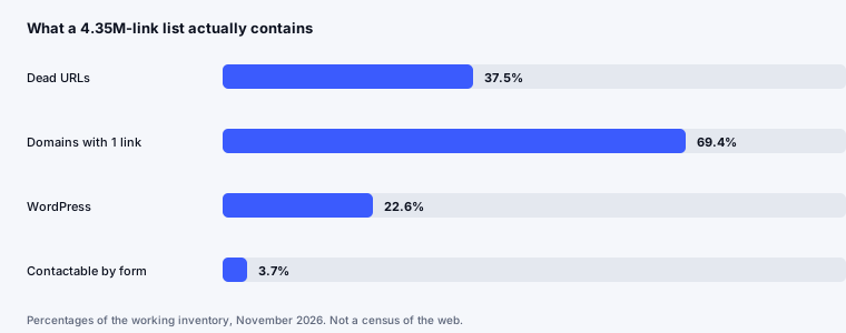
Of 1,738,830 distinct domains, 1,206,777 — 69.4 percent — appear exactly once. The median domain has one URL, the 90th percentile has four, and the maximum is 7,070.
This is the single most important thing to understand about list size. When a vendor says "one million domains", the arithmetic behind that number is mostly single-link domains. The number of places where you can plausibly place more than one link, build a relationship, or get a second mention is an order of magnitude smaller.
It also explains a pattern most people notice but rarely name: outreach lists feel enormous and then run dry in a week. The list was never that large; it was a long tail with a small head.
Finding 2: more than a third of the list is already dead
1,630,403 URLs are flagged dead — 37.5 percent — against 2,719,633 that are not. That number alone should change how anyone buys a link list: assume a third of any raw list will not load before you do a single thing with it.
There is a second, less comfortable number. Only 1,979,657 rows — 45.5 percent — have ever been checked at all. The dead flag is therefore a lower bound on decay, not a measurement of it. The unchecked half is where the surprises live, and it includes URLs that were valid when the list was built and have since lapsed.
Practical consequence: the first hour of any campaign should be verification, not outreach. A list of 10,000 URLs that has not been checked is closer to 6,000 live candidates, and of those maybe a fifth are relevant to your topic.
Finding 3: WordPress is 22.6 percent, and Blogger still exists
Of 4,350,036 URLs, 982,793 sit on WordPress — 22.6 percent — followed by Blogger at 182,995, "other" at 161,486, Ghost at 5,187 and Drupal at 1,667. The remaining 3,012,680 rows have no detected CMS.
Two things follow. First, if you are building a placement process, WordPress is the only platform worth optimising for at scale: the submission mechanics, the editor, and the plugin surface are all there. Second, Blogger at roughly 4 percent of the list is a reminder that a meaningful share of the "blog" ecosystem is abandoned, low-effort property. It is not worthless, but it is not where citations come from.
The large "no CMS detected" bucket is mostly static sites and custom builds, which is where a surprising number of genuinely good niche sites live — and where automated outreach fails, because there is no form and no obvious contact.
Finding 4: only 3.7 percent of domains can be contacted by form
141,028 URLs across 63,978 unique domains showed a contact form. Against 1,738,830 domains, that is 3.7 percent.
This is the number that should reframe outreach expectations. The apparent opportunity — hundreds of thousands of domains — collapses to tens of thousands of contactable sites, of which a fraction are relevant to any one niche, of which a fraction accept guest content, of which a fraction reply.
It also explains why reply rates look catastrophic in most reports. If you measure replies against the list you started with, you are measuring against a denominator that was never contactable. Measure against contactable, relevant, responsive sites and the arithmetic is far less grim.
Finding 5: dofollow data is mostly missing, including ours
This is the finding we least expected and most needed to publish. On the dofollow field: 3,604 URLs are marked dofollow, 137,419 are marked nofollow, and 4,209,013 are unmeasured.
In other words, 96.8 percent of our own inventory has no dofollow signal at all. We are not unusual in this; we suspect that most vendors quoting "100 percent dofollow" lists are quoting an assumption rather than a check. Confirming the attribute requires fetching the page and parsing the anchor, which is expensive at millions of rows and therefore usually skipped.
The honest position: dofollow status is a per-placement check, not a list attribute. Anyone selling it in bulk is selling you a promise they cannot have verified.
Finding 6: the tail is where the relevance is, and the tail is unglamorous
64.8 percent of domains are .com, followed by .org at 6.2 percent, .net at 2.3 percent, .uk at 2.3 percent, and .de at 1.7 percent. That distribution is unsurprising. What matters is what it hides: the sites that actually answer a niche question are usually small, single-topic, and invisible in aggregate statistics.
Which brings the data back to the argument in our other piece: the pages that get quoted in AI answers are rarely the pages with the biggest link profiles. They are the pages that answer a question completely. A list sorted by domain metric will systematically surface the wrong sites, which is why we sort ours by contactability and topical fit first.
What we changed in our own process because of this
- Verify before counting. Report live, relevant, contactable URLs, never raw list size. A campaign of 400 verified targets outperforms 10,000 unverified ones, including on cost per placement.
- Score single-link domains honestly. They are fine for one placement and useless for a relationship. The plan for a 7,000-URL domain and a 1-URL domain should not look the same.
- Stop selling dofollow as a list attribute. Check it after placement and report what was found. It is a slower promise and a true one.
- Optimise the WordPress path. It is a fifth of the supply and the only platform where a repeatable process pays for itself.
- Treat contact forms as the bottleneck. 3.7 percent contactable is the constraint the whole funnel runs through, so the tooling belongs there, not in list generation.
List size is a marketing number. Live, relevant, contactable URLs are the only number that predicts whether a campaign can deliver.
Limits you should hold us to
This is one inventory, built for one purpose, at one point in time. The dead rate will drift upward as URLs lapse. The CMS detection is a guess from page markup and will misclassify some sites. The contact-form flag only catches forms on the URL itself, not a form on a contact page two clicks away, so the true contactable share is higher than 3.7 percent — we would rather publish the conservative number and say so.
What we would like from anyone quoting link data: the denominator, the check date, and the percent actually measured. Those three numbers turn a claim into a finding.
Finding 7: decay is not evenly distributed
Once we split the dead rate by platform, the average stops being useful. Dead share by detected CMS: none 15.6%; wordpress 82.1%; blogger 100.0%; other 99.8%; ghost 100.0%. By top-level domain: .com 37.7%; .org 37.3%; .net 35.4%; .uk 37.8%; .de 35.5%.
The pattern is consistent with how these sites are run. Platforms with low maintenance cost and high abandonment accumulate lapsed URLs; large country domains hold up better because they are attached to businesses rather than hobby projects. If you are buying supply, this is where a filter pays for itself: excluding the platforms with the worst decay removes a disproportionate share of dead rows before you spend a single verification request.
It also explains why two campaigns on lists of the same size produce different results. Same row count, different composition, different effective size.
The three queries behind these numbers
We prefer publishing the method to publishing a screenshot. Every figure above comes from one of these shapes:
- Population.
select count(*), count(distinct domain) from links— 4,350,036 URLs across 1,738,830 domains. - Concentration. Group by domain, count rows per domain, then read the median and the 90th percentile. Median 1, p90 4, maximum 7,070.
- Decay.
select dead, count(*) from links group by dead— 1,630,403 dead against 2,719,633 alive, with 45.5 percent of rows never checked at all.
Nothing here required a proprietary tool. It required being willing to publish the denominator, which is the part most link data marketing quietly omits.
What we would measure next, if we had the month
Three measurements would change how this inventory is used, and none of them exists yet:
- Contactability two clicks deep. Our form flag only sees the URL itself. Sampling contact pages would probably raise the 3.7 percent into double digits and change the economics of outreach entirely.
- Placement survival over twelve months. We know 37.5 percent of URLs were dead at some point; we do not know how quickly a placed link disappears. That number would tell a buyer what a placement is actually worth over a year rather than on the day it goes live.
- Which of these URLs ever appear in AI answers. The most valuable filter we could build is the smallest one: the few hundred domains that answering engines actually cite in a given category. Everything else is supply.
The last one is the direction the entire discipline is moving in. A link list is no longer judged by how big it is, but by whether the pages on it are read by the systems that now answer buying questions.
Curious what the AI layer looks like for your own site? The free check runs the buying questions on a real assistant and shows the pages it cited.
Run the free AI visibility check →Frequently asked questions
How much of a purchased backlink list is dead?
In our inventory, 1,630,403 of 4,350,036 URLs — 37.5 percent — were flagged dead, and only 45 percent of rows had ever been checked. Assume a third of any raw list is unusable until you verify it.
Why do backlink lists count so many domains?
Because 69.4 percent of domains carry exactly one URL. The median domain has one link and the 90th percentile has four, so domain counts grow fast while usable supply grows slowly.
What share of targets accept contact?
141,028 URLs across 63,978 unique domains showed a contact form — about 3.7 percent of domains. That is the real size of an outreach list, and it is much smaller than the domain count suggests.
Can you tell dofollow status before placement?
Rarely in bulk. Only 3,604 URLs in our inventory were confidently marked dofollow and 137,419 nofollow, leaving 4,209,013 unmeasured. Treat dofollow as a per-placement check.
Is this representative of the whole web?
No. It is a working outreach inventory, so it over-represents sites that accept submissions and under-represents large media properties. The distribution shape is useful; the totals are not a census.
Written by the OptiLink team, from our own inventory of 4,350,036 URLs. Related: Do backlinks matter for AI search? · AI visibility audit: the 30-minute checklist